Extreme Makeover; blog edition
Monday, November 2, 2009
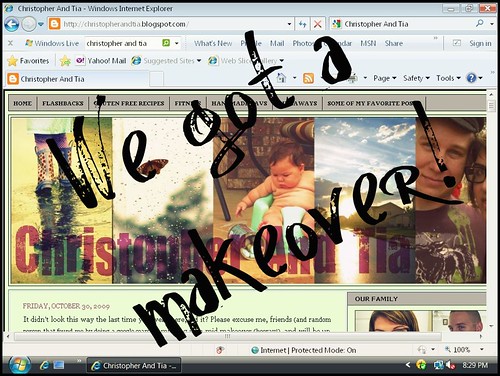
You've probably noticed by now that we did a little remodeling over the weekend (a huge thank you to my friend Amy, over at Muddy Boots, without her I would have never gotten a move on it). Some of you love it. Some of you hate it. I myself, I love it, but I can see how a few of you might not be so quick to jump to say the L word. Its different.
First, real quick, lets just all get into the DeLorean (which by the way, I thought was pronounced delorium? I fell into a fit of laughter when Christopher corrected me. I'm obviously awesome right now) and take a ride back to the beginning of our blog. ChristopherAndTia- March, 2008 (scroll all the way down to the bottom for our very first post). I wish I had a screen shot of what my blog must have looked like back then, but at that time I don't think I even knew what a screen shot was. Based on content alone though, you can see that things have come a long way. My photography, my topics (I had no energy back then, and was plagued by my health problems and obesity), my amazing run on sentance skills (ok so maybe they're not amazing, but would you be able to make sense of anything that I write without them?).
Want to know why I started my blog (I'm about to tell you anyways, whether you soundlessly said yes or no)? ...To promote my Etsy shop... Yes, really. But in the 19 or 20 months since then, I've realized that I am much better at keeping an online interactive journal than I am at trying to sell my handmade (and lets face it, not so fantastic) crafts. I'm not really that good at crafting anyways, especially when I'm trying to make something for somebody that I don't know on a personal level. Plus, I hate putting a price on something that I've made. But I do like to take pictures and write. So somewhere in all of that, my talent and direction evolved.
So back to the blog makeover- What I love most about my new layout, is now I don't (and neither do you) have to scroll all the way down past all of the posts to see the things on my sidebar. I had been wanting to try a 3 column template for awhile now, but was too chicken to do anything about it, fearing that I'd erase everything that I had ever written. So my sidebar just kept growing, and growing, and growing- until one day a blogger friend of mine (Hey Amy!) emailed me and asked me if I could maybe use a hand with it? "Yes, please!" I begged.
Up at the top there, above the banner (which is enormous now, I know, much bigger than my last one, which is another feature that I love about the new look) you'll see a long bar of links. One for Flashbacks, one for gluten free recipes (which I'll be doing a lot more of in the near future), fitness (yeah, I'm going to drag you all along with me while I break a sweat), my Etsy favorites (even though I don't sell on Etsy anymore, I still support handmade, absolutely), giveaways (speaking of, is anybody interested in sponsoring an upcoming giveaway? hehe), and then a link to a page of all of my favorite posts.
Over there on the right ---> you'll see our sponsor spots *waves*, links to friends blogs, other blogs that I write for (ok there is only one link for that, but-), a couple of diy tutorials, the archives, blah blah blah, things like that.
Down below, is the follow box (I still get so excited when somebody follows me, hehe), my contact information, and a grab-our-button thing.
Ok, so now that you've had the grand tour and you're a little bit more familiar with the new look, what do you think? Likes, dislikes? I'd love to hear your feedback. Things aren't completely finished, I've got a little bit of tinkering to do, but since y'all are the ones that come here and choose to look at it, your opinion matters to me.






19 comments:
Oooo so nice! Everything is so organized and I dig the colors. Great makeover!
It's amazingly beautiful and highly readable. More than before even.
Well... I read your blog via an RSS Feed, so I have no idea what it looked like before, lol. (I know, how disapointing!) But I checked it out and it looks great! And I just wanted to say that your run on sentence skills are my favorite part about your blog! ;)
I love it! I have been overwhelmed by the three column thing too, but I am not brave enough to attempt it yet.
I have done a giveaway with you before, but I would be happy to do another. No worries, if you get offers from first-timers I totally understand!
I like! Good job with it!
Tia - I can't read the comments very well...they are a super light green. Maybe it is my computer?
Thanks everyone for your feedback. I still haven't heard anything negative, and I want y'all to feel free to be honest here. Don't be shy to speak up.
Maria, thanks for letting me know! I've fixed it now, I think. Does it look better on your side?
I have to admit, I really liked the look of your blog before. :) I don't have an opinion either way on this one yet--but it is definitely growing on me. (It takes a while for me get used to different) I think what is important is that both layouts reflect your personality & this one makes it easier for you, so that is what is important. :) Nice job with the makeover!
It's fantastic!! Nice and clean, easy to read, and pleasing to my eyeballs. Nice Job and way to make mine look old and crusty. LOL ;-)
XOXOX
beautiful, my friend! i'm soooooooooo JEALOUS! xoxoxo
p.s. your crafts are fab. seriously. so shut up.
I am HIGHLY biased, but I think it looks great! Although I liked the green you had before. More colourful (yes, we spell it with an extra 'u' up here) like your personality.
I also think that they buttons you have on display are very tasteful. I get overwhelmed by some blogs and their need to display every. single. badge or button they can get their bells-and-whistles-loving hands on.
P.S. MY POSTCARDS JUST CAME! Woo hoo!
I love it too! I need to do a redo sometime soon. Add it to my always growing "to do" list.
TOTALLY unrelated, but Amelia saw Charlie's pic on your blog and didn't understand that he wasn't the same Charlie as on Charlie and Lola :)
Amy I think you're right, I liked the green a little bit more too. I'm still kind of playing with the colors. I wish I had a screen shot of my old blog, to kind of compare ya know? I'll probably switch it back to green :)
I really like the new layout, I LOVE the fact that you have a tab now for your gluten free recipes, I had been thinking about combing back through your posts to glean some of the info you posted in relation to gf food! Very very nice, A+ for you! I need a blog makeover badly, sadly I have no idea about such things, maybe one day I'll step into this century, maybe I can borrow your Delorium? (he he)
love the makeover - so sleek and clean! i love the use of your own photography especially.
xo,
emily
teaandlaundry.com
I love the makeover! It is a fresh start to November and your new life focus on mama blogger! So happy how everything is turning out- I am enjoying your blog more now than ever ( although I always enjoyed it) xo
Thanks so much everyone, for all of your wonderful feedback. It seems like a few of you are glad to see a tab up top for gf recipes, so I'm glad that we put that there. Little changes might be coming here and there, but for the most part, I think we'll keep it the way it is right now.
YAY I'm so glad so many of you like it :)
First, I happen to be one of the folks that LOVES your makeover. I'm so glad you took the plunge. It is fab. So readable and lovely. The green is delicious as well.
Second, I love to read your writing.
Oh my gosh! You added my button too :) So sweet of you :)
Post a Comment